Details
As mentioned elsewhere, this module relies on the background image set within the module controls. The background gradient, video, pattern and mask options have been removed from the typical control selections. There are controls for adding a logo image, title, sub-title and buttons having animation controls for each except the logo. Though the examples show a hidden navigation menu with a reveal on scroll, this is not default and must be enabled. The only default for layout is the segment pattern shown in the example and fullscreen mode. As can be seen in the Posts within the demo site, the Segmentor module can also be used for most anything defined in Divi including the Theme Builder.
Below, you’ll find depictions and explanations of some of the fine points of the module options.
Text

Text
All of the text items shown can use dynamic content. This is especially useful when using the module in Theme Builder.
Title - This is the main title text if used. As mentioned, it can be populated with dynamic content.
Sub-Title - this is generally where smaller font will describe more about content can be found on the page or post. If dynamic content is used, if an excerpt is created within the page/post content, it can be substituted/inserted here.
Button One and Button Two - these buttons can be linked to any content including other pages/posts or to content within the same page/post.
Image

Images
Logo Image - this selection is optional. If used, the logo image is placed first as content. There are no particular animation options at this time.
background Header Image - in lieu of using the Background control to set the background image, this can be used alternatively, especially if dynamic content is chosen and featured image, etc., is used.
Link

Button #1 and #2 Link URL - ordinarily, the URL entered here would be to another site page, post or external site. However, the link can also be an html "id" attribute on the same page which would enable scrolling to that element.
Background

Background
The premise behind this module is to focus on the image as opposed to gradients or patterns. These settings have purposefully been removed but might be included in a later release. As can be seen, most other controls are available, yet do not rely on the parallax setting.
It should also be noted that the image used for the background must have dimensions in excess of what would generally cover the entire screen. This typically would be a minimum of 1280px wide and 650px in height.
Segments
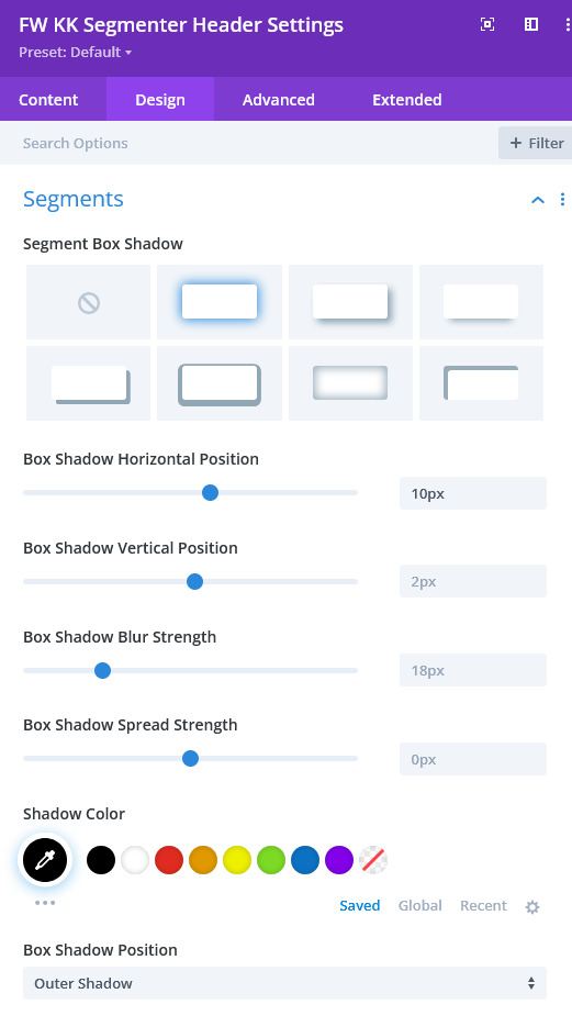
SEGMENTS
Segments have a default box shadow setting to simulate the 3d effect. This control can be used to modify the intensity of the shadow if desired. Although the box shadow can be eliminated, the effect may not be as expected.
All Other
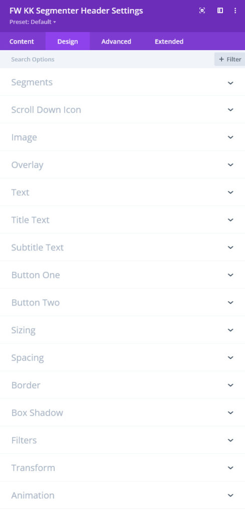
All Design
As can be seen, there are controls for every content item that might be used in the content. One important note is the use of the Text control which is NOT defaulted to show or position the content in the center of the screen. If centered content is desired, this will need to be set in this control. All of the other controls allow complete styling of each content element.
Layout
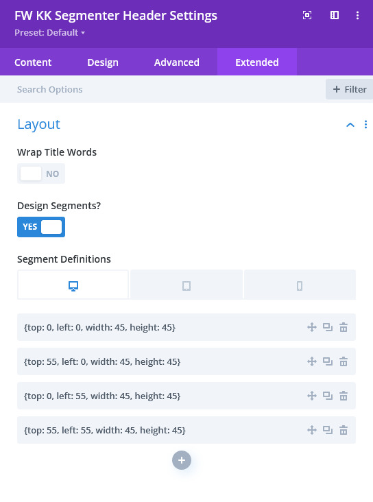
Layout
Wrap Title Words - the main title can be any length but beyond twelve characters including spaces, the animation for the title will look like that in the "Segmentor" example page. If multiple words are used in the title, twelve chars will come into play most often. This toggle will break the title phrase into words and they will display each on a single line.
Design Segments? - this toggle will reveal controls enabling the design of the grid used. If the toggle is "No", then the default number and shape will be that as seen in the "Segmentor" example page.
The segments can be designed for the three devices indicated if desired. The design depicted in the control is the one found on the "Segmentor Four Corners" page. Each entry within the sortable list defines a segment in json notation. Each item, as labeled, represents a percentage unit. Top and Left indicates the top left corner of the segment. Width and Height dictate the rectangular size of the segment. All percentages will normally refer to the browser viewport.
Animation
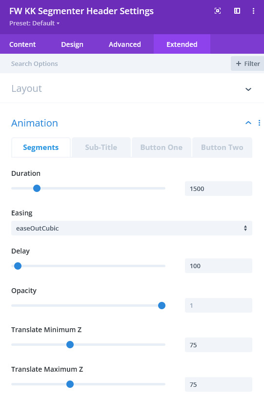
Animation
These controls define various aspects of the animation offered in this module version. For all of the content below, duration and delay are given in milliseconds and can be set with the slider or just typed.
Segments - in addition to duration and delay, Easing choices are available to effect different speeds throughout the duration. The Translate Z Min and Max allows a varying amount of "zoom" for each of the sections. A wide range will allow the script to randomly assign different zoom levels to each segment. This gives a slightly different view on each visit to the page.
Sub-Title - the sub-title animation is preset to fade-in (opacity) in this release. Setting the delay dictates at what point in the animation timeline when the opacity begins to change.
Button One/Button Two - these items have the same options as segments except for Translate. For X and Y, you can set a relative position for From and To. Considering where the Button(s) final position is via the CSS set for it, either by the module settings or otherwise, you can designate with negative or positive values where the Button animates from and to. If the initial CSS final location is where the button should be, then a 0 (zero) value is used for "To."